Orange Book Value Brand Guidelines
What is the significance of OBV Logo?
The Orange Book Value logo is indicative of the core philosophy behind the brand - providing a fair price for used vehicles which reduces anxiety and facilitates a deal between buyer and seller. With OBV, the buyer and seller would have the same reference price for any used vehicle thus reducing negotiations and buyer or seller remorse.
The OBV Logo depicts a well rounded balance in the interests of both the buyer and seller via two equal smileys, one straight, the other inverted. The blue colour symbolises trust, peace intelligence and loyalty, while the orange emits energy and warmth, all traits of the brand's personality. Finally, the choice of font exudes a strong, clear character. It's simple but not simplistic.
The tagline - ‘Resale ka MRP’ firmly communicates OBV as the benchmark price for resale. Like MRP for new products, OBV is the reference pricing for vehicles which acts as an indicator for a fair deal.

Brand logo & Favicon
Brand Guidelines
Background

Do's and Don'ts with the Logo

-
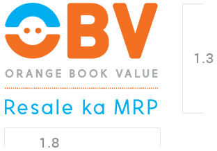
The length & breadth of the logo should always be in 1.8:1.3 ratio.
-
The smallest logo size that can be used is 1.5" (inches) on print, and 100 pixels for digital media.

-
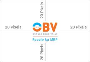
The margin to be used in the logo should always be 20 pixels with bleeds on all four sides.

-
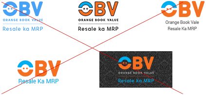
Do not alter the color and typography of the logo.

-
Do not alter configurations, add shadows to, or distort the logo components.

-
Do not alter configurations or distort and add shadows to logo components.

-
Do not rotate, animate the counter spaces in the letters of the logo.

Text Format
-
The brand name "Orange Book Value" should always be written with a camel case or OBV in Upper Case.

Color
-
The brand name "Orange Book Value" should always be written with a camel case or OBV in Upper Case.

No Alterations are Allowed in the Color or Logo Format
- Do not use colors other than the approved ones
- Do not outline the logo.
- Do not modify or recreate the provided artwork.
- Do not use the logo as part of a sentence.
- Do not layer other content on top or below the logo.
- Do not layer other content on top or below the logo.
Where to Use
- Can be used for co?branded campaigns.
- Can be used in company demos or presentations.
- Can be used on event signage.
Where Not to Use
- Should not be used on personal business cards.
- Should not be used on resumes.
- Should not be used on personal website/online store.


